
by Alberto F.
In theory “Abstract Graffiti” is a contradictory concept, at least when it comes to painting murals. The moment when the image spray painted on a wall abandons letters as its creative guideline, it automatically loses its title as graffiti and is labelled as street art or muralism. However, in recent years we have seen a series of artists who have managed to stay balanced on the razor’s edge that sharply divides the two concepts. These are the abstract graffiti writers, and their interesting work is well worth examining.
We like to think that abstraction manifesting itself through urban art is a very new concept, but in reality it has existed since the very beginning of graffiti. Just think back to Futura 2000’s legendary wholecar from 1980. In full swing of the New York City style war, he covered an entire wagon in paint and completely omitted the presence of any letters. Inexplicably, this wholecar, far from setting off a trend, remains in history as a singular precedent that fell short of making any revolutionary impact.

Entering the new millennium along with the emergence of so-called “street art,” abstraction would crystallize as a legitimate style amongst the wide array of formulas that were developing on walls. Nowadays, there are many street artists who choose abstract compositions as their aesthetic path. But it is precisely the absence of form and, in particular, the absence of letters, that prevents us from being able to label it as “graffiti” — with the exception of specific pieces carried out on trains and subways, like the ones we saw in the report on Paris .
While certain kinds of wildstyle could be considered abstract by those who can’t decipher it, we know that their original ideas are based on specific letters. So, outside of subjective interpretation, let’s look exclusively at the works of some graffiti writers who’ve held on to certain structural nuances of graffiti, despite abandoning the form of their letters.
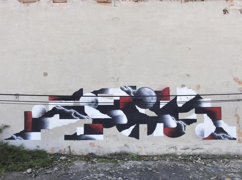
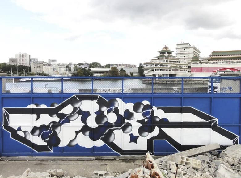
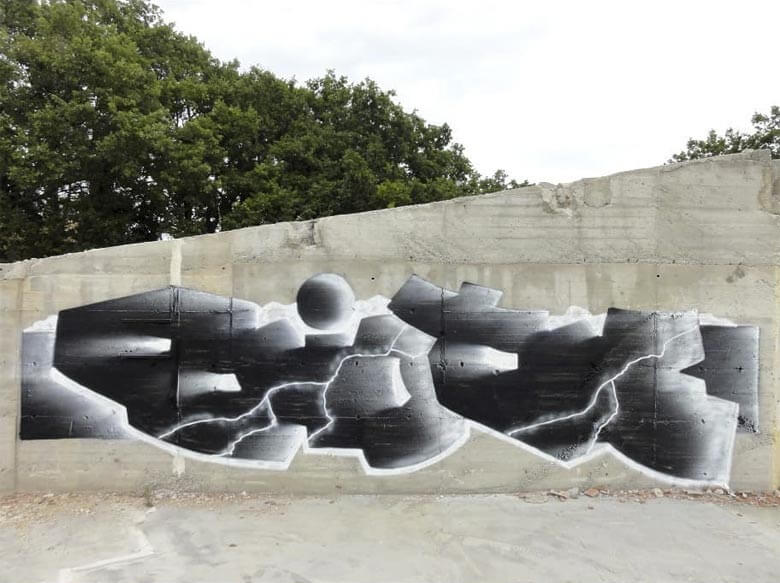
Cases like Eliote‘s are perfect examples. It’s his rejection of elements fundamental to the piece, like the outline, that transform his work into true abstract creations. Nevertheless, they do not lose the essence of what we consider graffiti.
On the other hand we have Spheo‘s work, which twists itself in a very specific direction. Using blending techniques worthy of 3D pieces, his work plays with the textures of the walls; generating relief effects that, despite being unintelligible, still seem to be representative of graffiti pieces.

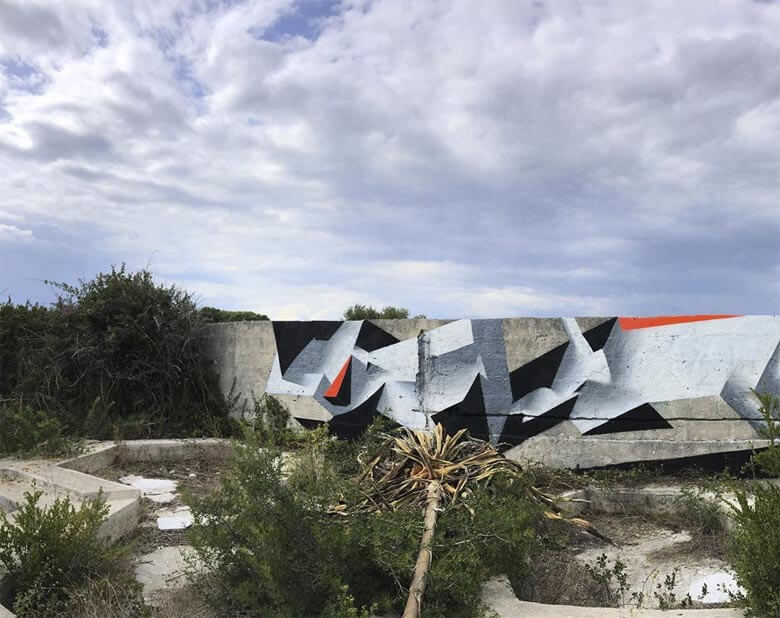
The amazing works by L’outsider present an abstraction that’s more technical than figurative, since it’s easy to appreciate the typographical studies on which they’re based. Despite the expressively artistic result, it’s not only the importance of the letters keep his work anchored to the most basic ideas of graffiti; his tools and colors are those of street writers as well: MADMAXXX in silver and black.


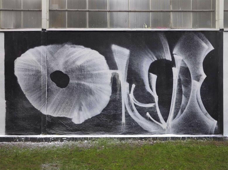
Xpome’s experimental graffiti, in its infinite variants, demonstrates a resourcefulness that drives his letters towards certain degrees of artistic abstraction. Even so, his most remarkable quality is the conceptual abstraction that leads him turn each piece into a completely different universe, isolated from any one specific style or trend.


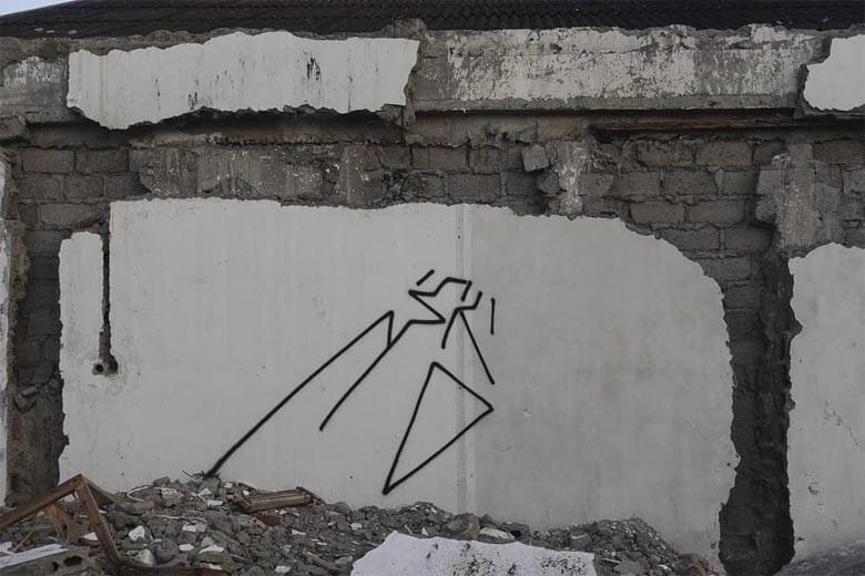
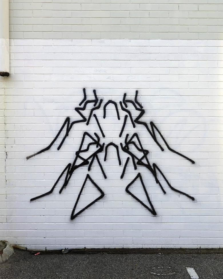
Finally, it’s also worth highlighting is the work of Risote. True to the purest graffiti form of them all: tagging. He subjects his signature to extreme experimentation, leading him to render indecipherable combinations of straight lines that interplay with various forms of symmetry. A technique as personal as it is interesting.

2 What do you think?
Add a comment