Serval, graffiti writer and artist, member of the 7$ and ATT crews, started painting in his native Geneva in 1992. Although it was tags that got him started, his style is essentially classic —quality wild style— with letters rooted in tradition, sometimes accompanied by characters. Today his artistic spectrum has grown outside of official graffiti channels, but today he is still an indispensable reference in the scene. We present the 3 aces of this mythical writer.
This is about the most difficult exercise I could imagine for myself, I’m rarely if ever fully satisfied with my artwork and I also hold a very strong emotional bond to what I do, so that I feel strongly about the walls I’ve painted in good, bad and sometimes mixed feelings. This being the MTN website, I went for style writing pieces, vs more abstract work or illustration. I tried to focus on just the painting itself, not the context or moment, otherwise it would have been a very different selection probably with the first magical moments of the beginning ( we can all relate) and the beautiful times shared with friends and creative inspiring people around the world…

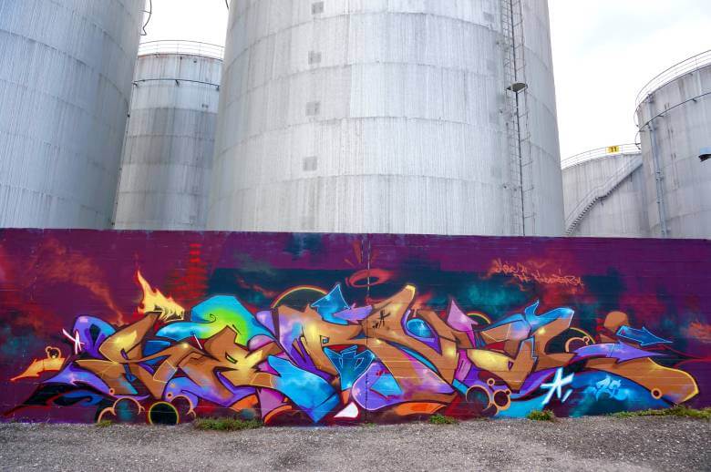
- Number one is the first time I felt I managed to successfully translate on a wall the love I have for certain colors and the way they can make certain shapes and proportions, tell a story and dance across a wall. I love the mix of new and very old-school techniques around outlining, inlining and illusions of depth on this wall, as well as the mid-tone very oil-painting inspired palette.

“This is about the most difficult exercise I could imagine for myself, I’m rarely if ever fully satisfied with my artwork and I also hold a very strong emotional bond to what I do…”
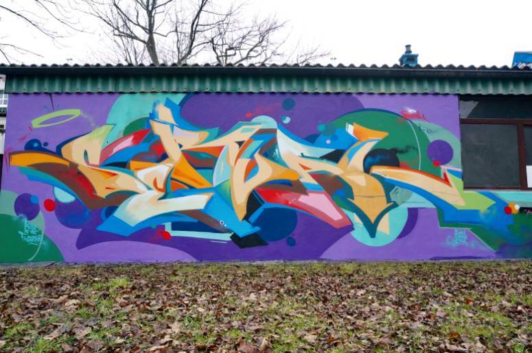
- The second one was painted for a post-graffiti event and I really wanted to push the flat abstraction techniques ( no outline, mix of graffiti and geometric shapes) while keeping the letterforms and connections very traditional. The color palette is very quirky and to the opposite of the previous piece, doesn’t bring a fluid narration, but rather plays with the eye to make the whole wall bounce.


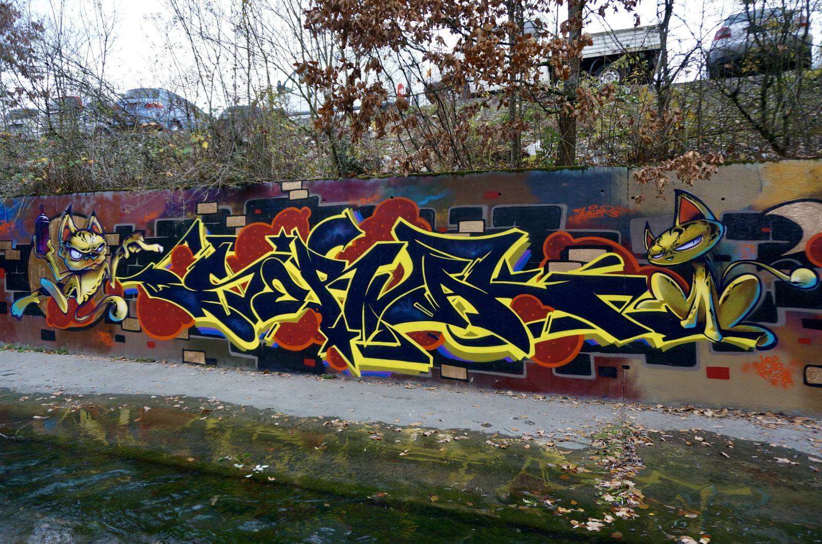
- For the last one I’m going to cheat (hey this is graffiti the point is to break the rules right? :)) and put two pieces. I love the classic buildup of letter/character and some background elements. I paint a lot of characters in various techniques, from graphic flat styles to more rendered illustrative approaches, and they’re super fun and fast to paint. I know my letter work is usually more well- known, and I enjoy using illustration to give the whole wall a specific atmosphere, sort of like a comic book or illustration would do, but with the letters as the central focal point. I like the vibe and atmosphere of both these walls and the variation in painting styles and techniques!
Thanks to Musa and MTN for the ITW!! Love to all.
2 What do you think?
Add a comment